
“Damask or satin?” is a useful starting question for a woven label, but it does not finish the specification. A label sits against a garment, carries small artwork, and must survive handling. The right construction is the one that reproduces the design and feels appropriate in the final garment.
Separate the weave from the artwork
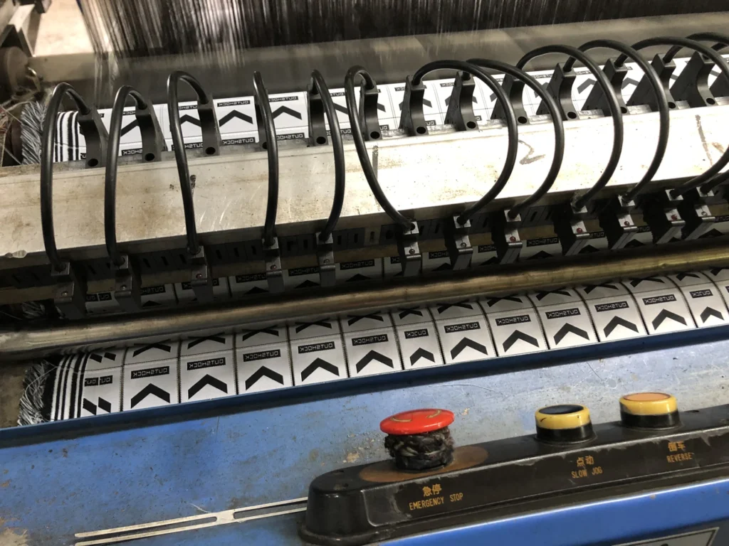
Woven labels form the design with yarn rather than printing ink onto a finished tape. In sourcing conversations, damask is commonly selected when a buyer wants a detailed woven logo on a relatively firm, flat face. Satin constructions are often requested for a smoother, more lustrous face. These are starting points, not guarantees: yarn, density, loom setup, and finishing change the result.
Do not assume that a tiny tagline will stay legible simply because the artwork is sharp on screen. Send the supplier the smallest text, thin lines, and color boundaries you intend to use. Ask for a woven proof at final size. If the design is too fine for the chosen construction, simplify it or consider a different label process.
Decide where the label will touch the wearer
A main neck label has a different job from an exterior brand tab or a sewn-in side label. For a neck label, evaluate the back as well as the front: loose yarn, fold thickness, and exposed cut edges can affect comfort. Ask whether the label will be end folded, center folded, loop folded, or sewn flat. The fold and seam position determine which edges remain visible or touch skin.
Specify the edge finish explicitly
“Soft label” is not an inspection standard. Include the label’s finished width and height, fold type, cut method, seam allowance, and acceptable edge condition in the approved sample. Look closely at corners and exposed cuts for fraying or stiffness. Check the label after attachment to the actual garment fabric; the same label can feel different on a heavy jacket and a lightweight top.
Compare samples with a simple scorecard
| Check | What to inspect |
|---|---|
| Artwork | Legibility of smallest text and clarity of the logo |
| Color | Yarn colors against the approved reference |
| Surface | Sheen and hand feel under normal retail light |
| Reverse | Loose yarn and comfort where it touches skin |
| Edges | Fold alignment, cut quality, and fraying |
| Attachment | Appearance after sewing to the real garment |
Keep one signed-off sample as the production reference. If you change artwork size, yarn color, fold, or garment placement, request an updated proof.
Preparing a label brief? Send the artwork, finished dimensions, fold type, placement, and garment material through the KEYIDI PACK inquiry page. A physical comparison is more useful than choosing by weave name alone.